Introducing v2.4.0
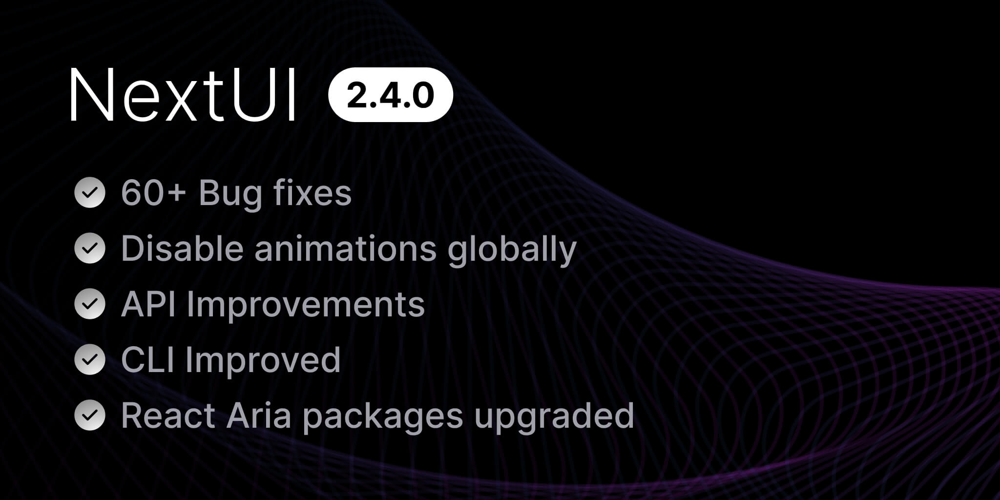
We are excited to announce the latest update to NextUI, version 2.4.0! This release introduces 60+ bug fixes, dependencies upgrades, improvements in API and CLI and more.
What's New in v2.4.0?
- Disable Animations Globally - Allows users to disable animation globally via NextUIProvider
- API Improvements - Includes several props like
disableRipple,skipFramerMotionAnimationsandvalidationBehavior - CLI Improvements - Includes new command options and optimizes performance
- React Aria Packages Upgrades - Upgrades and fixes the exact versions of React Aria
- Other Changes - Includes styling improvements, accessibility, usability enhancements and over 60 bug fixes across different component packages
Upgrade today by running one of the following commands:
nextui upgrade
Disable Animations Globally
NextUI components are animated by default and can be disabled by setting the prop disableAnimation individually. Since v2.4.0, you can globally disable the animation by setting disableAnimation to NextUIProvider.
"use client";import {type ReactNode} from "react";import {NextUIProvider} from "@nextui-org/react";export function AppProvider(props: AppProviderProps) {const {children, className} = props;return (<NextUIProvider className={className} disableAnimation>{children}</NextUIProvider>);}interface AppProviderProps {children: ReactNode;className?: string;}
API Improvements
disableRipple
By default, there is a ripple effect on press in Button and Card component and can be disabled by setting the prop disableRipple individually. Since v2.4.0, it can be disabled globally by setting disableRipple to NextUIProvider.
"use client";import {type ReactNode} from "react";import {NextUIProvider} from "@nextui-org/react";export function AppProvider(props: AppProviderProps) {const {children, className} = props;return (<NextUIProvider className={className} disableRipple>{children}</NextUIProvider>);}interface AppProviderProps {children: ReactNode;className?: string;}
skipFramerMotionAnimations
We can control whether framer-motion animations are skipped within the application. This property is automatically enabled (true) when the disableAnimation prop is set to true, effectively skipping all framer-motion animations. To retain framer-motion animations while using the disableAnimation prop for other purposes, set this to false. However, note that animations in NextUI Components are still omitted if the disableAnimation prop is true.
"use client";import {type ReactNode} from "react";import {NextUIProvider} from "@nextui-org/react";export function AppProvider(props: AppProviderProps) {const {children, className} = props;return (<NextUIProvider className={className} skipFramerMotionAnimations>{children}</NextUIProvider>);}interface AppProviderProps {children: ReactNode;className?: string;}
validationBehavior
We can set validationBehavior to either native or aria to control whether to use native HTML form validation to prevent form submission when the value is missing or invalid, or mark the field as required or invalid via ARIA. If it is not specified, aria will be used by default.
"use client";import {type ReactNode} from "react";import {NextUIProvider} from "@nextui-org/react";export function AppProvider(props: AppProviderProps) {const {children, className} = props;return (<NextUIProvider className={className} validationBehavior="native">{children}</NextUIProvider>);}interface AppProviderProps {children: ReactNode;className?: string;}
CLI Improvements
Refactor Init Flow View
We've refactored the init flow view to provide a better user experience.
The latest flow view output:
┌ Create a new project│◇ Select a template (Enter to select)│ ● App (A Next.js 14 with app directory template pre-configured with NextUI (v2) and Tailwind CSS.)│ ○ Pages (A Next.js 14 with pages directory template pre-configured with NextUI (v2) and Tailwind CSS.)│ ○ Vite (A Vite template pre-configured with NextUI (v2) and Tailwind CSS.)│◇ New project name (Enter to skip with default name)│ my-nextui-app│◇ Select a package manager (Enter to select)│ ● npm│ ○ yarn│ ○ pnpm│ ○ bun│◇ Template created successfully!│◇ Next steps ───────╮│ ││ cd my-nextui-app ││ npm install ││ │├────────────────────╯│└ 🚀 Get started with npm run dev
Add Vite Template
We've introduced a new Vite template pre-configured with NextUI v2 and TailwindCSS. The following command is to initialize a new Vite project named my-vite-app.
nextui init my-vite-app -t vite
Package Manager Flag
We've introduced a new flag -p (or --package) to init command to allow users to choose the package manager to use for the new project. By default, npm is used. For example, the following command will initialize a new NextUI project with the app template named my-nextui-app using pnpm package manager.
nextui init my-nextui-app -t app -p pnpm
no-cache Flag
We've introduced a new flag --no-cache to allow users to disable the cache. By default, the data will be cached for 30 mins after the first request. It is useful when the data is cached, and you wish to upgrade to the new version just released after the first request. In this way, you can run the following command
nextui --no-cache upgrade
Upgrade Version Output
You can now run the upgrade command and see the summary version of the package you are upgrading to.
Upgrade And Remove Select View Optimization
The disabled option(s) will be displayed in the bottom of the list.
Doctor Command add peerDependencies check
The doctor command now checks for peerDependencies and displays the incorrect peerDependencies. (See nextui-org/nextui#2954 for more).
React Aria Packages Upgrades
We've upgraded and fixed React Aria packages dependencies across our components. This update focuses on enhancing accessibility, ensuring better compatibility with the latest versions of React Aria, and resolving previously reported bugs.
Breaking Changes
Export improved cn utility
If you are using it from
@nextui-org/react, no changes are required.
The new cn utility exported from the @nextui-org/theme package includes tailwind-merge to avoid conflicts between tailwindcss classes overrides and includes the config for NextUI custom classes.
If you are using the cn utility from the @nextui-org/system,
import {cn} from "@nextui-org/system"
or @nextui-org/system-rsc package,
import {cn} from "@nextui-org/system-rsc"
you need to update the import as follows:
import {cn} from "@nextui-org/theme"
Validation Behavior
Since v2.4.0, we've changed the default validation behavior to aria which means no native validation is applied. If you wish to use the native validation, you can set validationBehavior to native to the input components or set it to the Provider as stated above.
For those who use validationBehavior="aria", validate will be no longer applied since it is only for native validation. Therefore, you need to switch to use isInvalid prop instead.
<form onSubmit={onSubmit}><Input errorMessage={formErrors?.field1} isInvalid={!!formErrors?.field1} name="field1" /><Button type="submit">Submit</Button></form>
Other Changes
Bug Fixes:
- Fixed popover-based focus behaviours. PR - @wingkwong
- Fixed missing ref to input wrapper. PR - @wingkwong
- Fixed react-hook-form uncontrolled switch component. PR - @wingkwong
- Fixed focus on the first item when pressing Space / Enter key on dropdown menu open. PR - @wingkwong
- Fixed inputting spaces in textarea inside a Table row. PR - @wingkwong
- Fixed incorrect tailwind classnames. PR - @wingkwong
- Fixed onSelectionChange can handle number PR - @ryo-manba
- Fixed update type definition to prevent primitive values as items PR - @ryo-manba
- Fixed display placeholder text when unselected for controlled. PR - @ryo-manba
- Fixed the inert attribute in
CalendarMonthandCalendarPicker. PR - @ShrinidhiUpadhyaya - Fixed hiding of unavailable dates in RangeCalendar. PR - @ShrinidhiUpadhyaya
- Fixed calendar header controlled state on DatePicker. PR - @chirokas
- Fixed 'Tap to click' behavior on macOS for Accordion and Tab. PR - @ericfabreu
- Fixed incorrect margin on labels for RTL required inputs. PR - @mrbadri
- Fixed a type error in the onKeyDown event handler for the menu component. PR - @Gaic4o
Improvements
- Added
destroyInactiveTabPanelprop for Tabs component. PR - @wingkwong - Added pointer-events-none to skeleton base. PR - @wingkwong
- Revised isInvalid input styles. PR - @wingkwong
- Revised slider styles. PR - @wingkwong
- Removed unnecessary origin-bottom in button. PR - @wingkwong
- Set overflow visible after skeleton loaded. PR - @wingkwong
- Kept date picker style consistent for different variants. PR - @wingkwong
- Calculated the correct value on mark click. PR - @wingkwong
- Removed scrolling display during month change animation. PR - @novsource
- Added the correct peerDep version PR - @winchesHe
- Added missing export of TableRowProps type. PR - @sapkra
- Changed validationBehavior from native to aria by default, with the option to change via props. PR - @ryo-manba
- Made the VisuallyHidden elementType as span when the default parent element accepts only phrasing elements. PR - @kosmotema
- Refactored the useScrollPosition hook to improve performance and stability by using useCallback for the handler function and useRef for throttleTimeout. PR - @Gaic4o
Documentation:
- Updated documentation to reflect the new features and changes in the components, API references, and CLI.
Special thanks to NextUI Team members @kuri-sun, @ryo-manba, @sudongyuer, @winchesHe, @wingkwong, @tianenpang, @smultar and contributors for their contributions to this release.
For a full list of changes, please refer to the release notes.
Thanks for reading and happy coding! 🚀
Community
We're excited to see the community adopt NextUI, raise issues, and provide feedback. Whether it's a feature request, bug report, or a project to showcase, please get involved!
Contributing
PR's on NextUI are always welcome, please see our contribution guidelines to learn how you can contribute to this project.